Sperm Freezing in Los Angeles & San Francisco, CA

Name a 100-year old medical technique that is the purest form of preventative medicine, yet vastly underutilized? That’s right, it’s Sperm Freezing, also known as Sperm Banking.
Some men would like to have children but are not prepared to have them immediately. These men may also be concerned about their potential to have a healthy child as they get older. Taking steps now to bank sperm can help to preserve their current fertility when they want to conceive later. It can be very comforting for men to know that they have a supply of sperm that could help them to become a father later, especially if age, illness, or a vasectomy would make that difficult otherwise.
Dr. Paul Turek, an internationally renowned male fertility specialist, recommends sperm freezing to his patients who would like to keep biological parenthood an achievable option in the future. Read on to learn more about the benefits of sperm freezing.
Reasons to Bank Sperm
Successful freezing of sperm is a tried and true technology. Here are reasons to consider banking sperm:
- You have a medical or other condition (e.g. Diabetes), or are facing medical treatment for a condition (e.g. Cancer), that may threaten your future fertility.
- Freezing sperm before a vasectomy to keep your childbearing options open.
- You have a low sperm count or the quality of your sperm is deteriorating and you want to preserve your fertility.
- You have difficulty producing a semen sample on the day of fertility treatments and need a backup source of sperm.
- You are at risk of injury or death (e.g. You’re a member of the Armed Forces).
- You are about to undergo a sex change operation.
- You are getting older and would like children in the future, but are worried about the issues in offspring that occur with advanced paternal age.
For many patients, Sperm Freezing offers the opportunity to keep a precious resource tucked away as they forge ahead on life’s unpredictable path.
Things to Know About Freezing Sperm

The first step is to select a sperm bank with which to freeze. There are several throughout the US and many female fertility programs will also do this for men. Importantly, as a whole, the industry is very tightly regulated by the Food and Drug Administration (FDA) to ensure the security, confidentiality, safety and quality of the process.
The sperm bank you choose will then require an array of blood, urine and other tests from you to ensure that the semen specimens that you freeze are free of sexually transmitted diseases and can be safely used in another person after thawing.
You will then need to decide what kind of sperm banking “account” you would like to have: short term (typically 1 year) or longer term (typically 3-5 years) sperm storage. Costs vary between centers and states, but are generally in the same ballpark.
The next decision is how many semen samples do you bank? Since there is no guarantee that the sperm that you bank will actually lead to a pregnancy, it’s best to think of this process as an insurance policy. To guide your decision, realize that there are two levels of assisted reproductive technologies available to use the sperm after it has been thawed:
- Intrauterine Insemination (IUI). Timed to ovulation, IUI is a quick office procedure that is similar in complexity to a women’s PAP smear. At the fertile time of a women’s monthly, cycle, sperm is thawed, washed and then inseminated (or placed) within the uterus, well beyond the cervix. Normal activity is then resumed. Typically, each “normal” semen sample that is banked will allow for 2-3 IUI procedures after thawing. For each desired child, you should plan for 6 IUI procedures, which means freezing two to three ejaculates.
- IVF or in vitro fertilization. Although requiring far fewer sperm for pregnancy success, IVF (which may include intracytoplasmic sperm injection or ICSI), is much more expensive (by 10 fold) and longer (several week) process by which women are given injectable medicine to “ovulate” as many eggs as possible, instead of the normal single egg per cycle. Just prior to “ovulation,” all of the eggs are collected from the ovary through a 30 minute procedure generally performed under sedation. Eggs and sperm are mixed in a laboratory dish and fertilized eggs, termed embryos, are grown for 3-6 days and then put back into the female uterus in a procedure similar to IUI. Assuming normal semen quality, each banked ejaculate should provide enough sperm for many IVF cycles.
Verify Whether You Are Freezing Quality Sperm
The Turek Clinic runs tests to verify how much sperm is in the semen sample, and that this sperm has ideal motility (movement) and morphology (shape). While sperm can still be frozen regardless of semen quality, this information can be helpful in deciding how the sperm might be used and with which technologies to produce a successful outcome when the sperm is unfrozen. Sperm harvested from sperm retrieval may also be frozen, though this should be discussed with Dr. Turek.
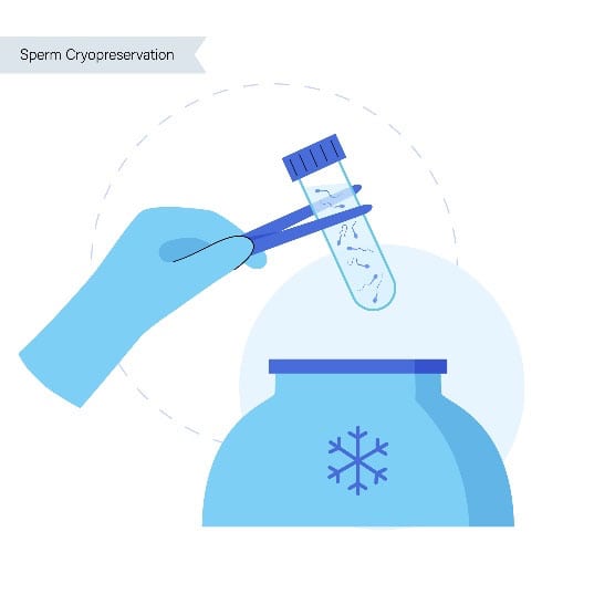
Sperm Freezing Process
Ejaculates are frozen in a sperm-friendly solution, termed a cryoprotectant. Commonly, cryoprotectants contain glycerol along with sugars such as sucrose and are supplemented with either egg yolk or soy lecithin. Sperm are frozen in sterile vials or “straws” by either a controlled-rate, slow-cooling method or using a flash-freezing process known as vitrification until –196 degrees Celsius (-320 degrees F). In general, as with egg freezing, vitrification leads to better sperm survival after thawing than slow cooling.
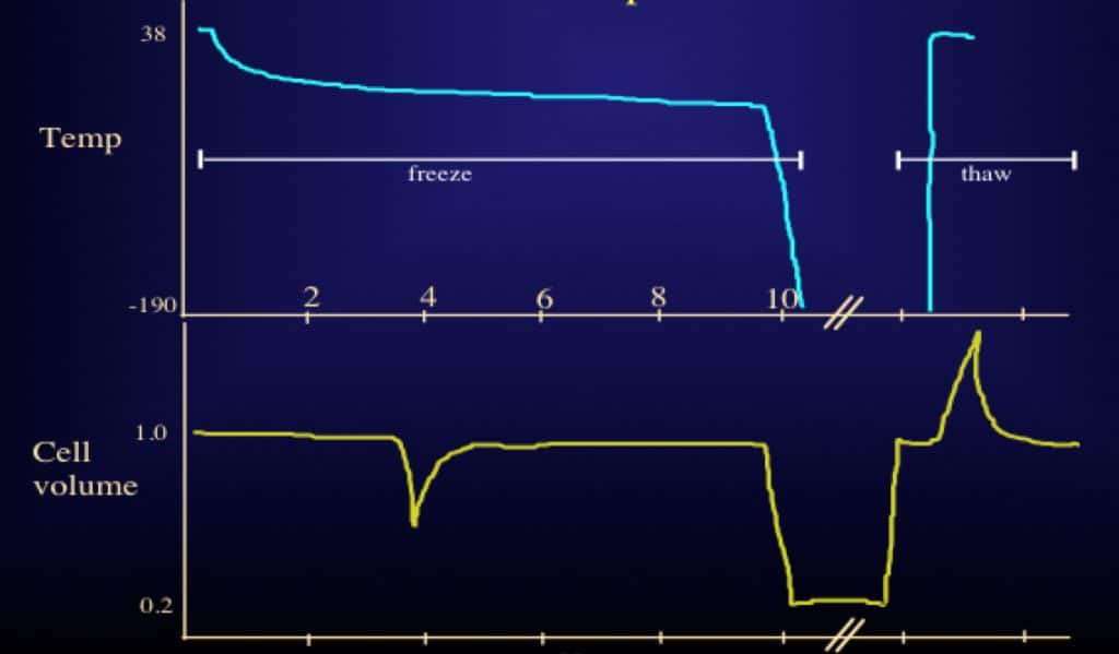
When needed, frozen vials of sperm are thawed at room temperature for use. Typically, all of the sperm that is frozen is recovered, but the proportion of sperm that is alive and moving after thaw is reduced by 50% compared to before freezing. Importantly, what drives sperm recoverability the most after freezing and thawing is not the time that sperm is frozen (months to years) but rapid temperature shifts during the freezing and also during the thawing process. Interestingly, sperm freezing and thawing can also affect sperm “function” by causing a mild degree of sperm DNA fragmentation, which can affect the ability of sperm to produce a pregnancy. The use of antioxidant-rich cryoprotectants and improved freezing protocols can minimize this risk, however.
Finally, it is important to remember that there is no evidence of an increase in birth defect rates or chromosomal abnormalities in children conceived from frozen sperm compared with “fresh” sperm in fertile couples.
Frequently Asked Questions About Sperm Freezing
How long can sperm be frozen and banked?
As long as sperm is stored correctly under the right circumstances, it can be banked for an indefinite period. Samples frozen for more than 20 years have been used to conceive healthy babies.
Does freezing sperm damage it?
Usually 50 percent of the banked sperm survive the thawing process. This sperm is not damaged by the freezing process.
Can you freeze sperm at home?
Several companies offer at-home sperm freezing kits, which allow you to collect your sample at home and send it back to a lab to be frozen and stored. You cannot properly freeze sperm by yourself at home.
How many sperm samples should I freeze?
The number of samples that should be frozen varies by patient, depending on the situation. In men with normal semen quality, three samples will provide four to six opportunities to conceive with low technology (i.e., intrauterine insemination or IUI) and even more opportunities for in vitro fertilization (IVF). Most men freeze at least two samples.
Ultimately, the choice is up to you. Dr. Turek will advise you about the number of samples to freeze based upon your future goals and any planned medical treatments.
Are there any risks to men who choose to freeze their sperm?
The are no health risks or side effects for men who provide sperm samples and bank their sperm. The only risk is that sperm vary widely in their ability to survive the freeze-thaw process, and this makes it difficult to accurately predict the post-thaw semen quality of a particular semen sample. Please note that there is no increase in the rate of birth defects in children who are conceived using frozen sperm versus those conceived with fresh sperm.
What happens when I want to use the sperm?
When you are ready to use your sperm samples, you will need to contact your sperm bank several weeks in advance and schedule an appointment to pick up the samples or make arrangements to have them shipped to you or your doctor. The sample will be thawed and washed free of the cryoprotectants. At that point, the sperm is ready to be used for IUI or IVF, depending on the recovery after thawing.
Does insurance cover sperm banking?
Sperm banking is usually not covered by health insurance. Please contact your individual insurer to inquire about your specific plan and coverage.
Can my sperm sample be contaminated by another sample?
Reputable sperm banks are meticulous about labeling your sperm sample correctly, typically employing “triple-verification” and handling it with extreme care. It is also reassuring to know that there is both federal (FDA) and state regulation of tissue banks.
How can I prepare to give the best sperm sample?
You will need to have specific, FDA-required blood tests for several sexually transmitted diseases before banking sperm. The type and number of tests differ, depending on whether the semen samples are being used for your intimate partner or for a third party (i.e., egg donor or surrogacy). In addition, these blood tests have to be negative for you to eventually use the semen samples; however, there are exceptions to this rule for some tests done in California.
To prepare for your sperm collection appointment, refrain from intercourse or masturbation for two to three days (but not more than five days, as older sperm can die in the case of infrequent ejaculation).
Ideally, you should be as healthy as possible to bank the best sperm. Refrain from smoking, drinking or using drugs in the weeks leading up to your appointment. If you take any medications, Dr. Turek will advise whether you should temporarily stop taking them or adjust your dosage.
When preparing to give your sample, do not use any lubricant unless it is supplied by the clinic or lab. Do not use spit, and do not use a condom. Ejaculate directly into the container provided by the clinic, and ensure it is properly marked with your name, date of birth and date of collection.
What rights do I have to my sperm after a sample has been banked?
You and you alone retain authority over your sperm and the decision to continue freezing your sperm or to use or destroy the sample. Unlike other property you may own, nobody “inherits” your sperm for use unless you explicity (e.g., in writing) “will” this to happen. You may wish to appoint an executor in your will who can carry out your wishes in the event that you die while sperm is still frozen. You can also specify that your partner has the right to use your sample if you are not able to decide upon its fate.
What kind of costs are associated with sperm banking?
After paying the initial fee to open the sperm “bank” account and test and freeze your sperm, you will need to pay an annual rate (usually several hundred dollars) for every year that you keep your sperm frozen.
Is fresh sperm better than frozen sperm with procedures like IUI/IVF/ICSI?
Studies have found that there is not a significant difference in success rates when fresh and frozen sperm are used with procedures like IUI and IVF. It’s true that the quality of sperm differs among individuals but it is generally excellent, and usable sperm is recovered.
Why do some couples decide to freeze embryos?
Some couples decide to freeze embryos (fertilized eggs) rather than freezing sperm and/or eggs separately. This is a good option for couples who have decided, but are not yet ready, to have children, or who have an illness that may make them infertile in the future, or who are undergoing IVF and want to store extra embryos for more children.
For more information about sperm freezing, please call or email The Turek Clinic today.